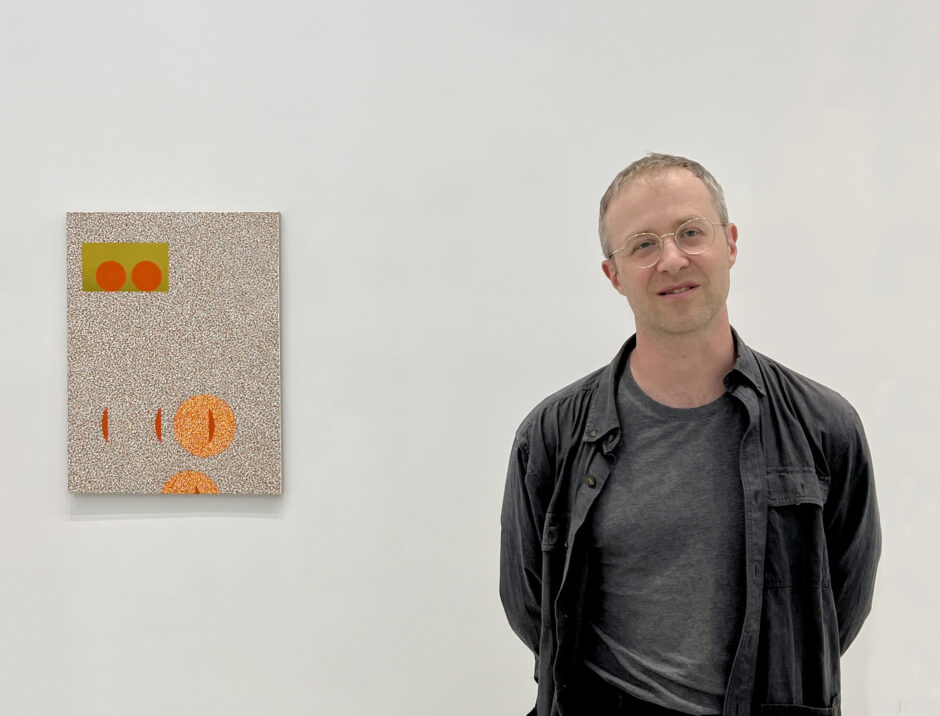
Graham Anderson
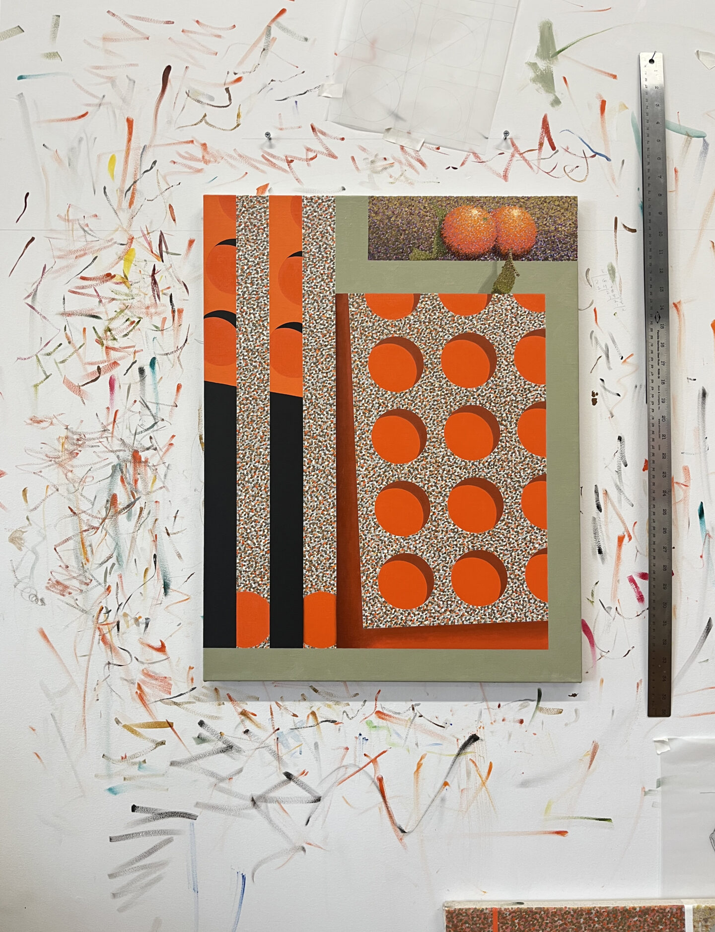
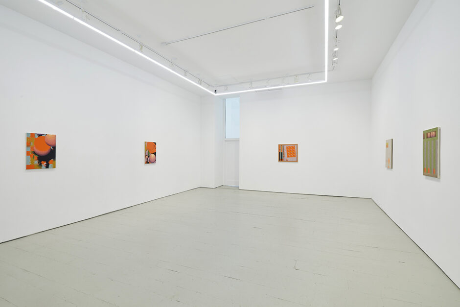
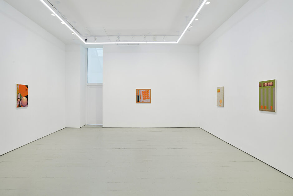
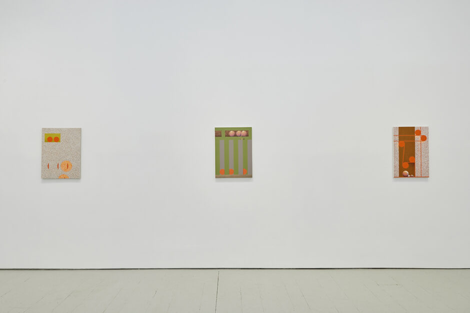
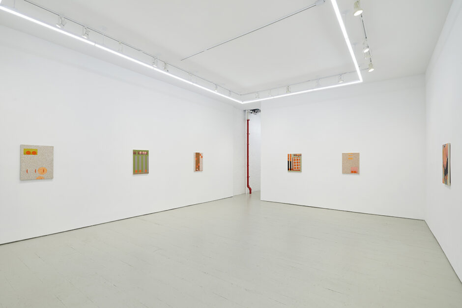
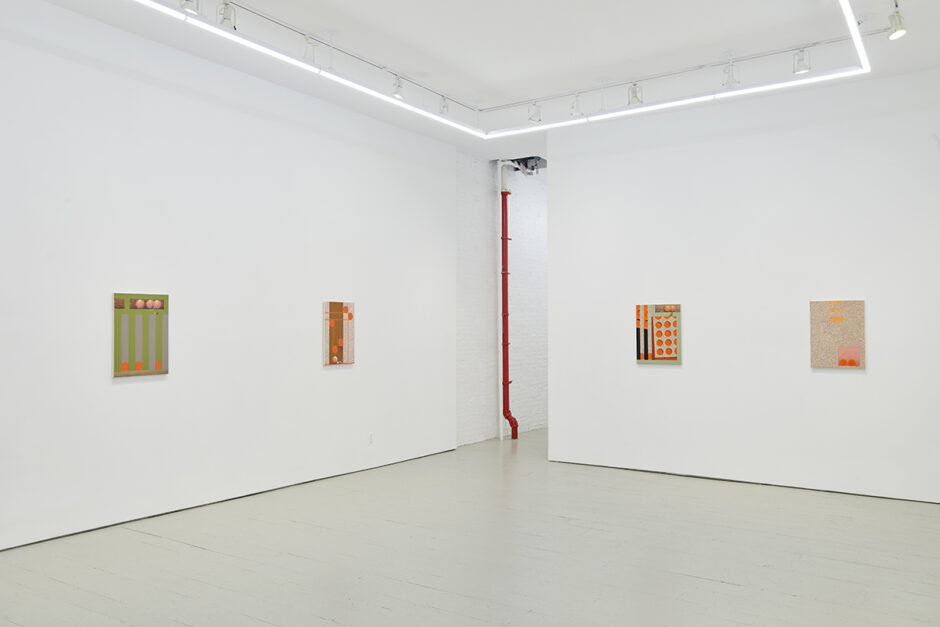
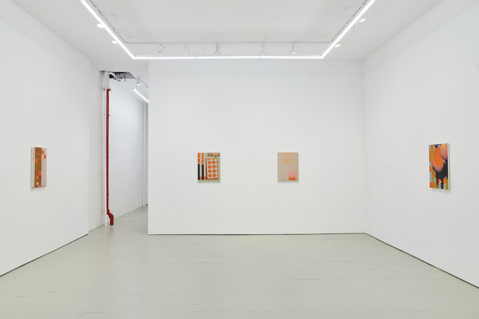
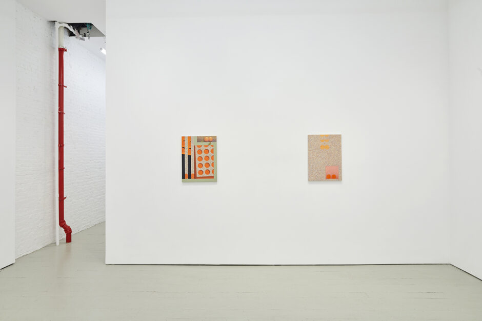
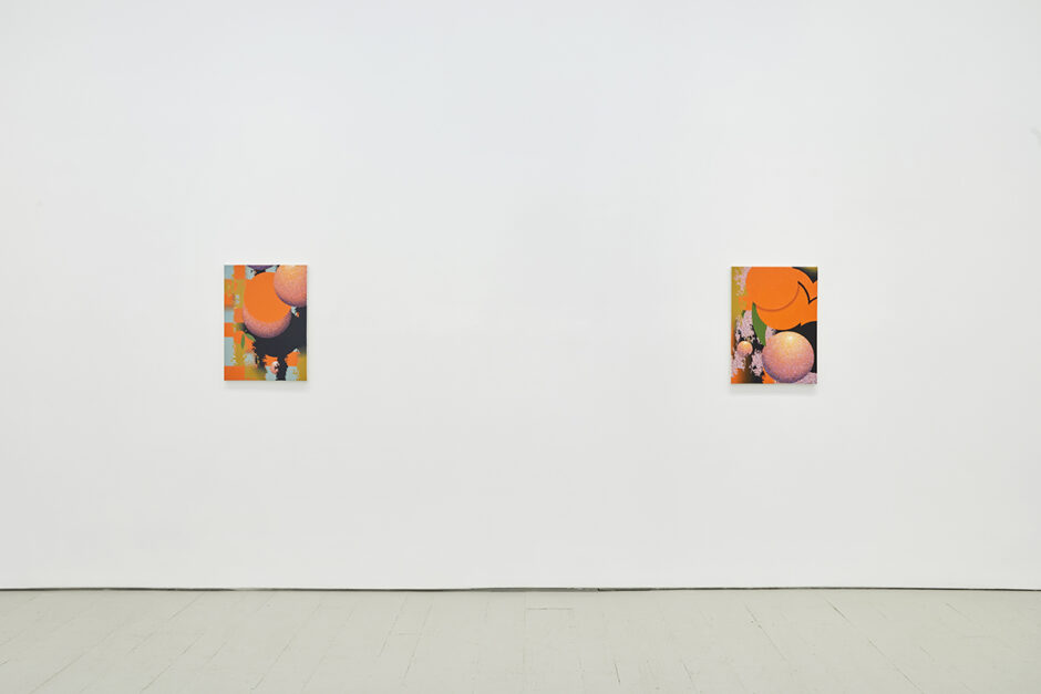
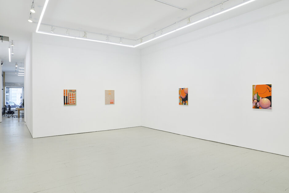
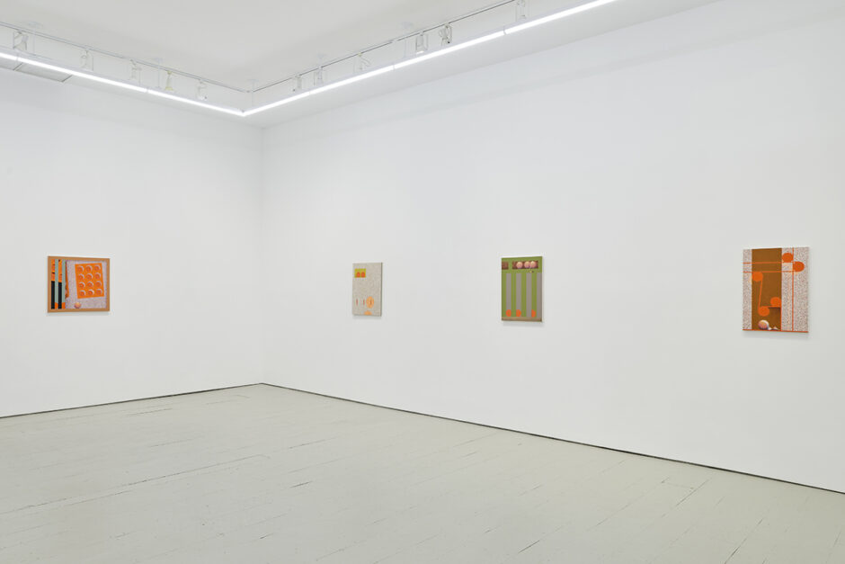
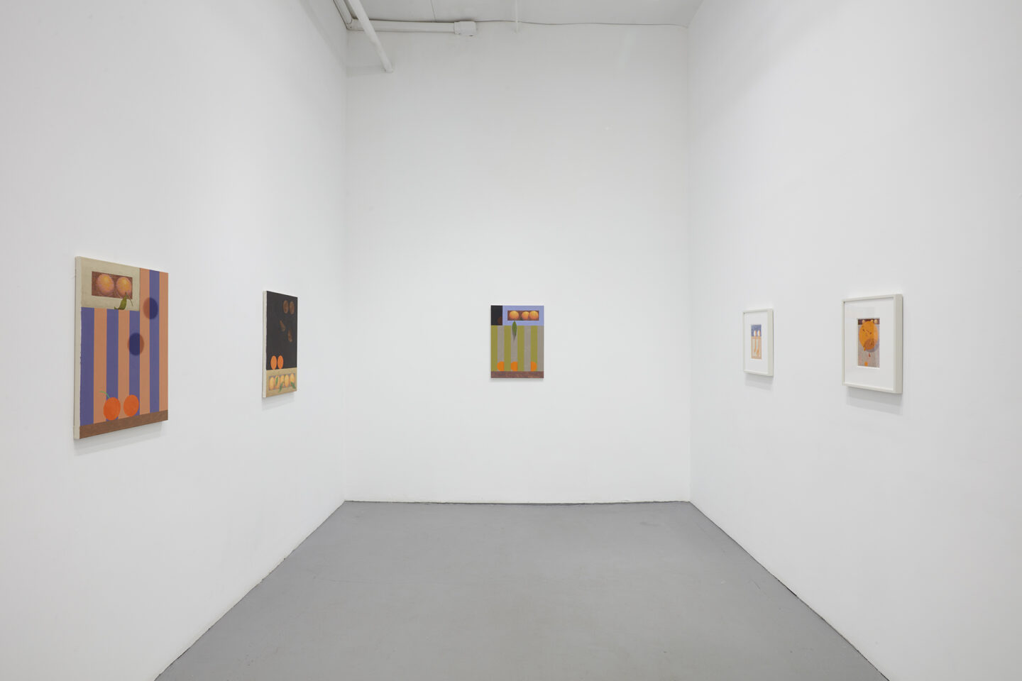
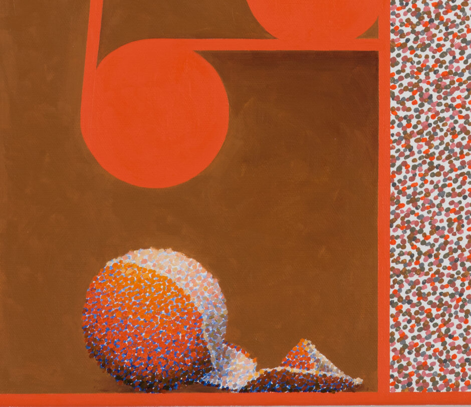
Graham Anderson‘s paintings defy expectations of spatial logic, stylistic purity, and distinctions between abstraction and representation. For Anderson, marks are akin to atoms: bits of information and material that coalesce or disperse to form fields of depth or larger volumetric form. Layers of pointillist dots create staticky grounds on which to explore planar overlap, illusions of scale, and the rendered shadows of trompe l’oeil.
For Edition No. 18 of KLAUSGALLERY.cloud, and on the occasion of Anderson’s new solo exhibition at the gallery, we look at the artist’s influences and process in his Brooklyn studio, and highlight a recent group of works on paper.
Pointillism, Process, and ‘Pantry Paintings’
Questions for Graham Anderson
When did you start using Pointillism in your paintings?
GA: I started using Pointillism in 2011. I was on a residency (Wiels) in Brussels, and I was looking at a lot of Magritte paintings. I saw a series of his works that used an ironical “Renoir” style Impressionism. They were a real departure from the work he had been doing up to that point. At that moment I had been looking to effect a break with some paintings of my own that I felt I had dead-ended and took inspiration from the move Magritte had made. But I thought, since I was well after Magritte, I would use Post-Impressionism to make some new pieces. Of course I never made a full and total departure with my previous work.
The pseudo Pointillist method I took up meshed with the way I had been thinking of atomization and dissolution by breaking up figures into small parts in my most recent paintings and the way I had always been interested in demonstrating brush work as the constituent element of the paintings. It felt fresh to start using this new method and to get to play with the way it involves color and resolution.
You’ve also mentioned an interest in Dutch still life painting. What is it in particular that drew you that genre?
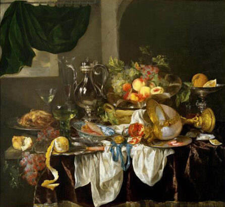
GA: There is a painting by Abraham Van Beyeren at the Seattle Art Museum called Banquet Still Life that depicts a table chaotically full of different fruits and other foods. It’s not a particularly compelling painting, but it does have a half-peeled lemon perched at the front of the table with its skin hanging off the edge in a beautiful spiraling curve. That one motif really grabbed me when I saw the painting in person. It has an interesting combination of realism and highly decorative idealism. The textures and the shapes of the fruit’s different parts are rendered with a lot of fidelity and precision in quite a seemingly scientific way. But the spiraling curve of the hanging peel is all artifice and very carefully sets the scene. There is kind of a dare being made there to believe in a proposed naturalism. It’s playful while being straight-faced. And I’ve been basing the feel of the peeled oranges in my paintings on its attitude.
“There is kind of a dare being made there to believe in a proposed naturalism. It’s playful while being straight-faced. And I’ve been basing the feel of the peeled oranges in my paintings on its attitude.”
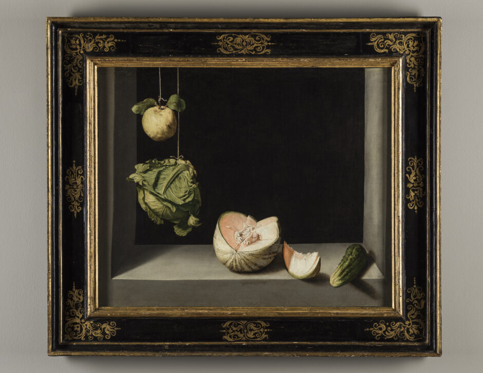
This one painting made me look at Dutch still life really for the first time. At the start of my orange painting project I had mostly been thinking of the work of Juan Sánchez Cotán who was a Spanish monk painting in the early 1600s. A lot of his paintings are what are called “bodegones” which translates to “pantry paintings” as I understand it. He very meticulously rendered fruits and vegetables placed on stone ledges in storage cellars in very simple severe arrangements. They have a lot of precision and severity while also a dark mystery to them due to the deep empty blackness of the cellar backdrop. The English art historian and theorist Norman Bryson wrote beautifully of these pieces in his book “Looking At the Overlooked” which is how I first encountered them.
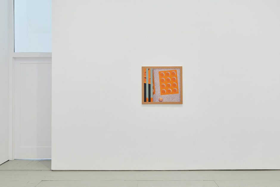
It’s interesting that Cotán’s works are referred to as “pantry paintings.” The reference is clearly to the fruits and vegetables of the pantry that he’s painting, but could also refer to the architecture of the pantry itself. You incorporate compositional devices similar to cabinetry and framing directly into your work. Can you speak to that a bit?
Yes, I think you’re right about the word “pantry” having a multivalent meaning here. I really love the strange space in Cotán’s paintings. The images are incredibly still and silent. The architecture of the space is the most prosaic kind of compositional structure, and becomes a stage. The starkness also creates a drama that ostensibly should not be there, or even be possible. Profound energies are implied and strange forces are at play. Cotán was a monk when he made these paintings and they are a depiction of the spiritual enormity revealed through, or present in, a quiet unadorned physicality that he was experiencing. I love the trickery of his almost trompe l’oeil space. It feels like painting that gets to have its cake and eat it too. It gives you a very delicious illusion while making sure you know it’s an illusion. But the image feels all the more real by making sure you know it’s not real. It’s enjoyably indulgent to give yourself over to an illusion while knowing it’s an illusion. I think my use of framing devices is mainly in that spirit. There are critical aspects to this strategy as well, like the way that a frame can refer to the space in which the artwork resides and point to its commodity nature. But the tumbling of avowal and disavowal of the illusion is more what I like.
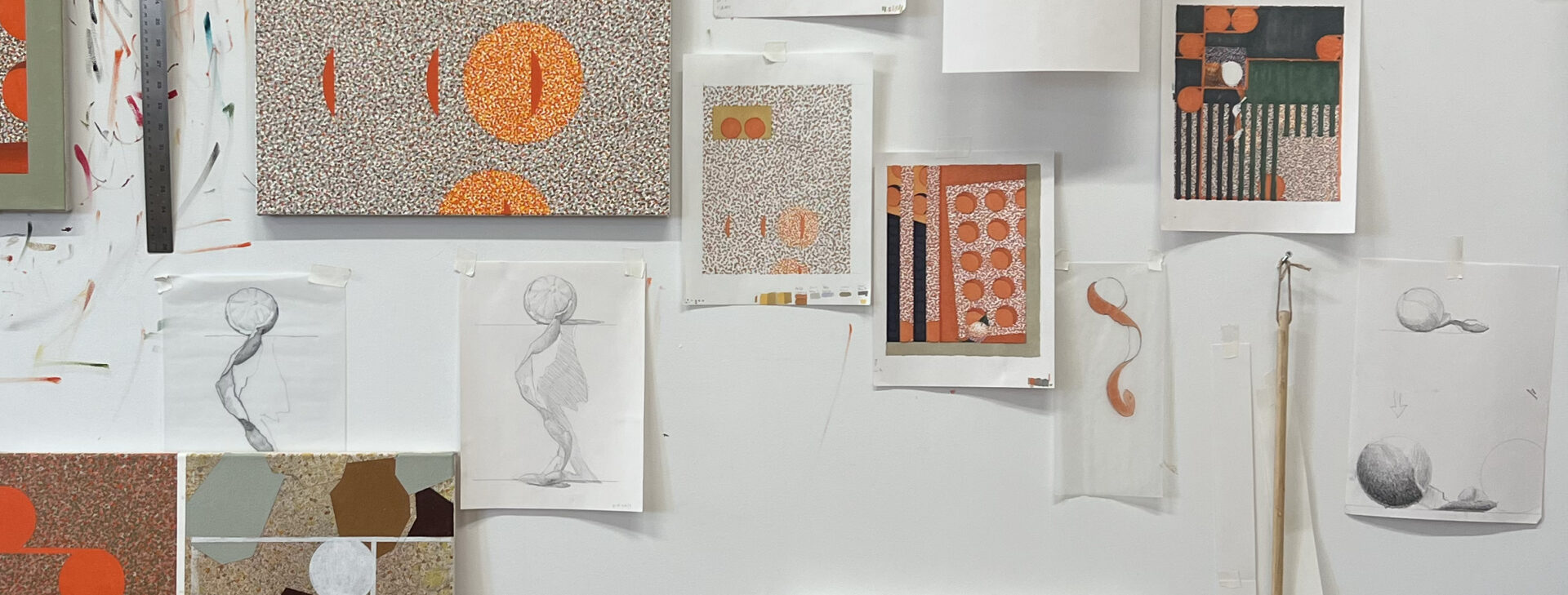
You seem to work through compositions in multiple stages, making marker drawings on paper, cutouts of shapes, small scale gouache paintings and then larger oil and acrylic paintings on canvas. How does an idea move from one material format to another?
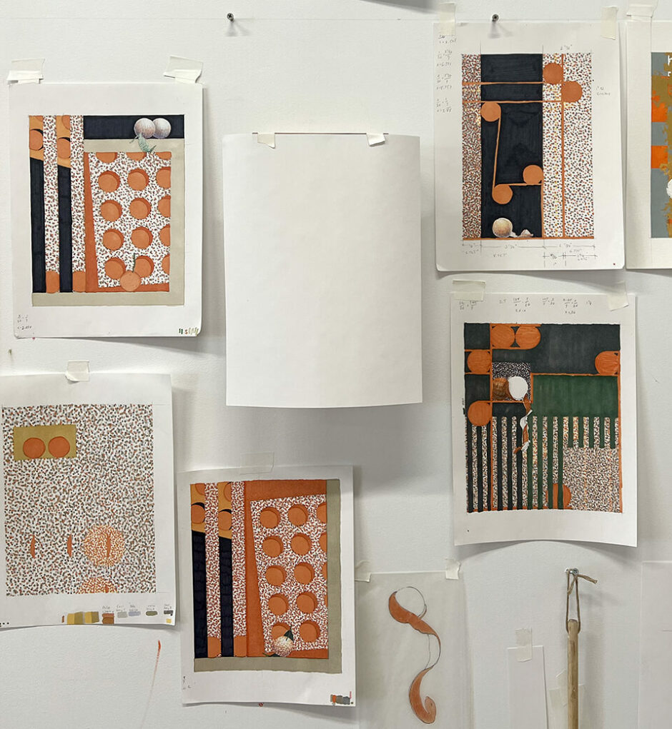
GA: I often start the process of a painting with a marker sketch. I love markers for many reasons. The color goes down immediately so I can start to see an image realized quickly before the idea dissipates. The colors are pre determined/ready-made which helps me to get away from just going with my own taste. Also the colors are complex and strange and I like trying to emulate their quality later on when I finally begin painting on canvas.
I like seeing the way an idea takes on different feelings in different materials. The marker drawings are translucent and casual and always have a very different attitude to them even if they get replicated with a lot of fidelity later on in oil and acrylic in the final painting.
The gouache paintings are another thing entirely. They have a solidity and resolution that the marker drawings never have, but are also much faster and less physically demanding than the paintings on canvas so I can try out ideas with them more easily. The quality of the paint has a multivalence that really appeals to me. I use it on watercolor paper so it absorbs into the paper and doesn’t retain an independent body, yet its opacity and matte sheen give it a nice firm presence.
“The fact that each of these planetlike orange circles is itself made up of tiny orange circles makes clear that the music of the spheres is also the music of atoms, and vice versa. But Anderson isn’t using his painting to illustrate this familiar, if always mind-boggling, truth. He’s using the truth to adorn his painting.”
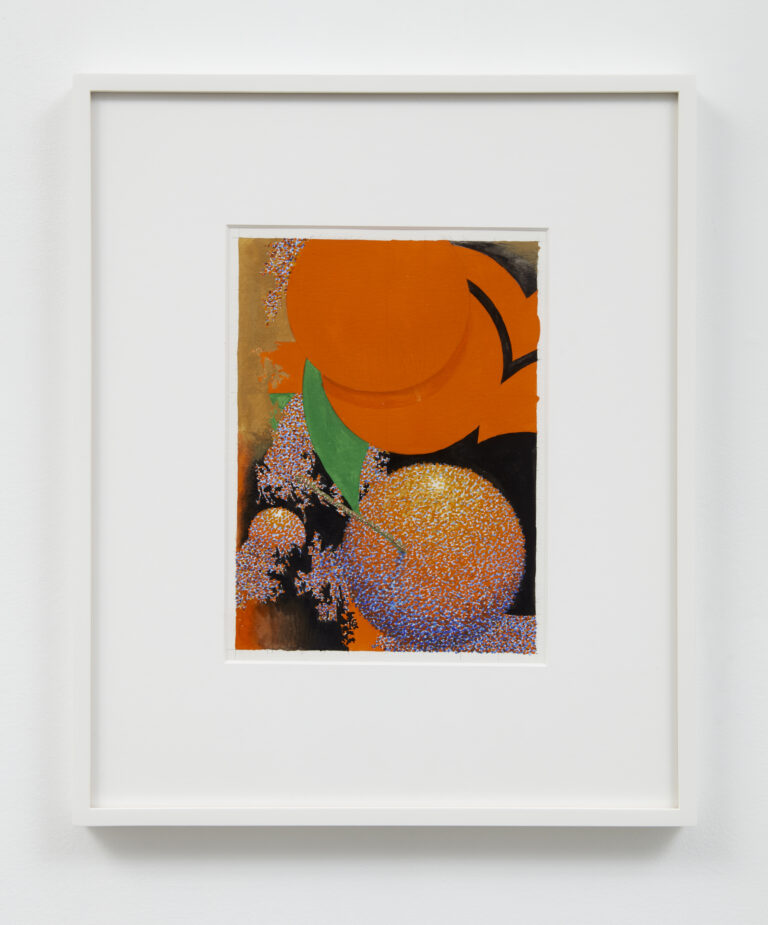
Graham Anderson
untitled, 2023
gouache and graphite on paper
16 ¼ × 13 ½ inches (41.28 × 34.29 cm) (framed)
SOLD
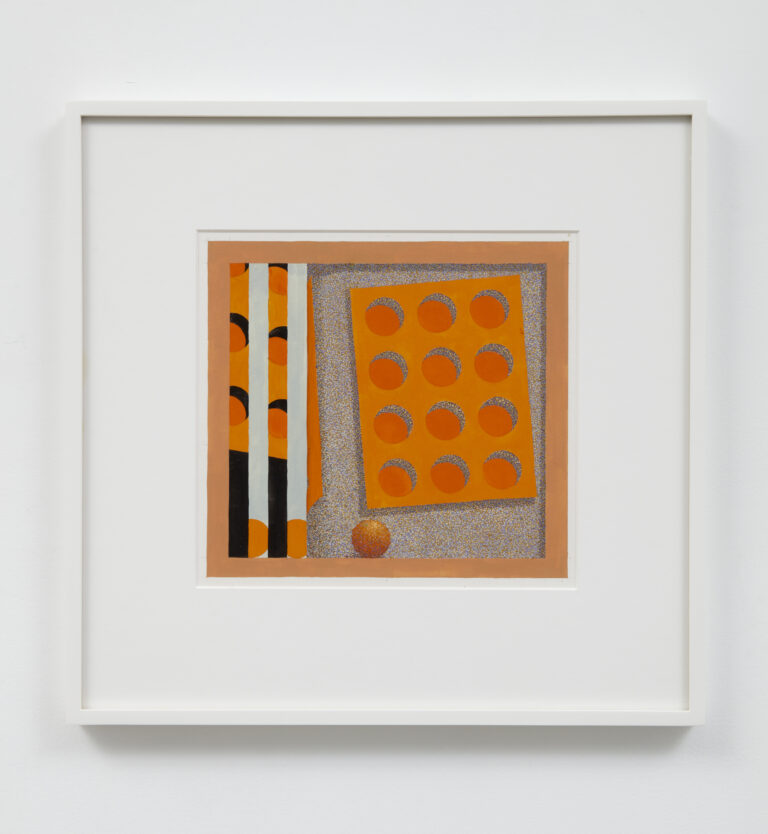
Graham Anderson
untitled, 2023
gouache and graphite on paper
16 × 16 ½ inches (40.64 × 41.91 cm) (framed)
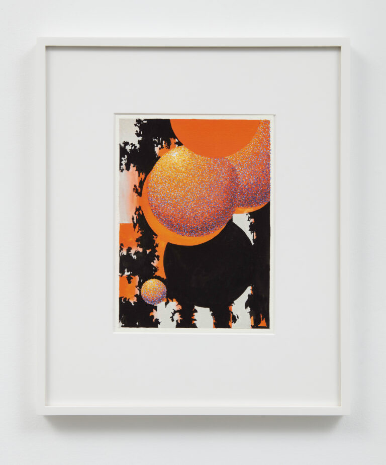
Graham Anderson
untitled, 2023
gouache and graphite on paper
16 ¼ × 13 ½ inches (41.28 × 34.29 cm) (framed)
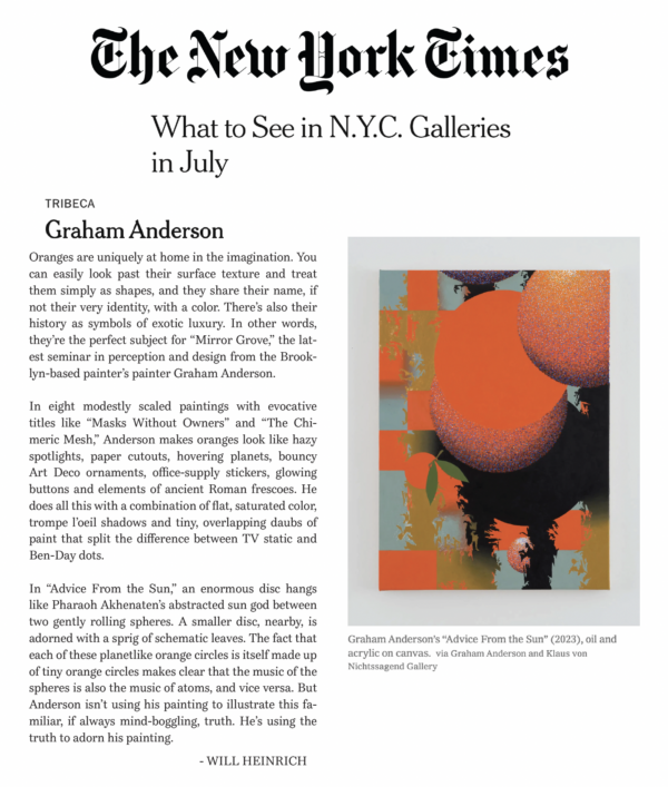
Will Heinrich’s review of Graham Anderson’s “The Mirror Grove” was published on July 14, 2023 in The New York Times.
Read the review online here.
Graham Anderson – The Mirror Grove
on view through August 11 (extended) at KLAUS VON NICHTSSAGEND GALLERY