David Scanavino
We recommend the latest version of Safari, Firefox, Chrome, or Microsoft Edge.
Throughout the past 15 years, David Scanavino’s artistic practice has been invested in the experience of material and color; specifically how the two can be fused to create an emotional response. From his early installation work made from colorful VCT tile (of the type often found in institutional environments such as schools and hospitals) to his recent naturalistic images made of paint and pigment on tanned cowhide, the reaction between colors is paramount to the visual impact of the work. Embedded in the optimistic graphic punch of deeply saturated primary colors and exaggerated candy tones is the sense of time that comes with memory and loss, familiarity and adversity.
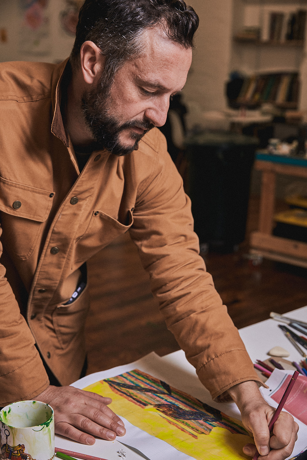
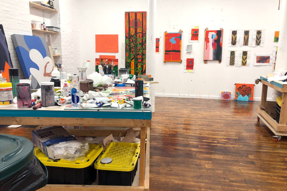
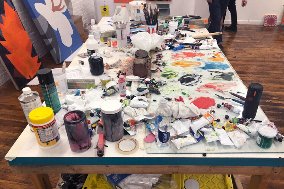
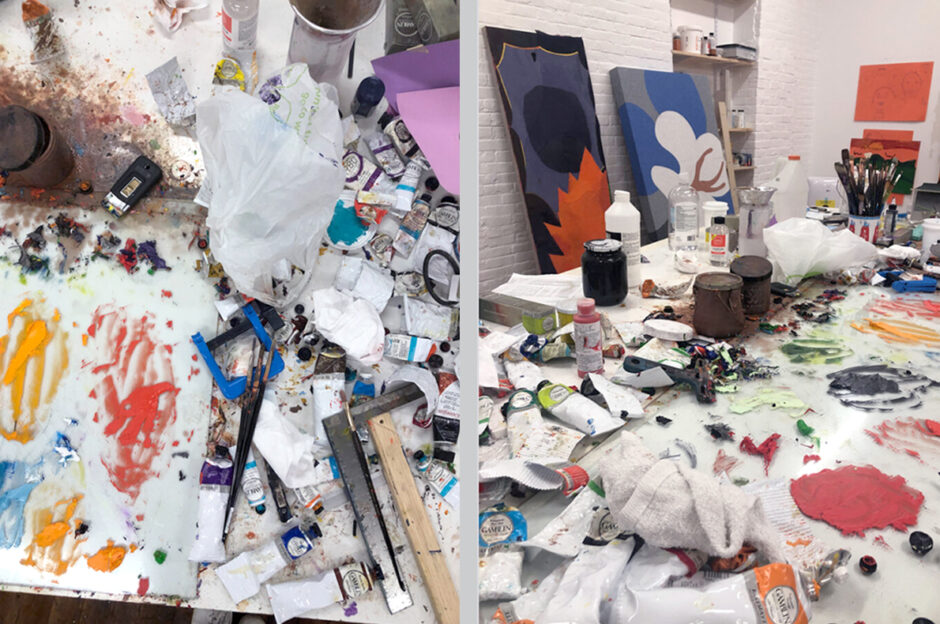
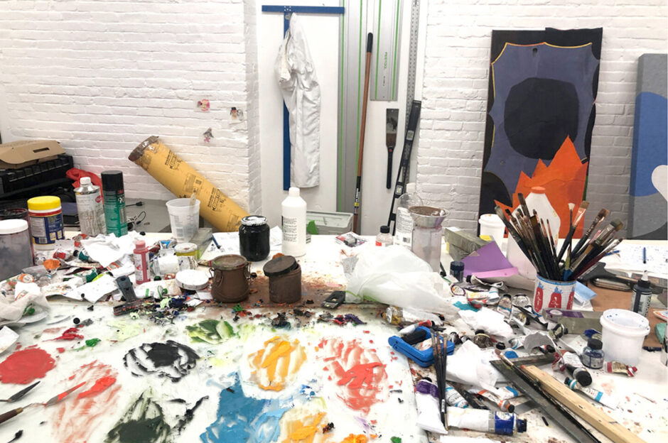
Edition No. 13 of KLAUSGALLERY.cloud takes a look into Scanavino’s studio outside of Providence, RI where he recently relocated after 20 years working in New York. The online presentation coincides with Klaus Gallery’s inclusion of new paintings by the artist at NADA Miami 2021 from December 1-4, and features works on paper made during the autumn of 2021.
VCT Tile
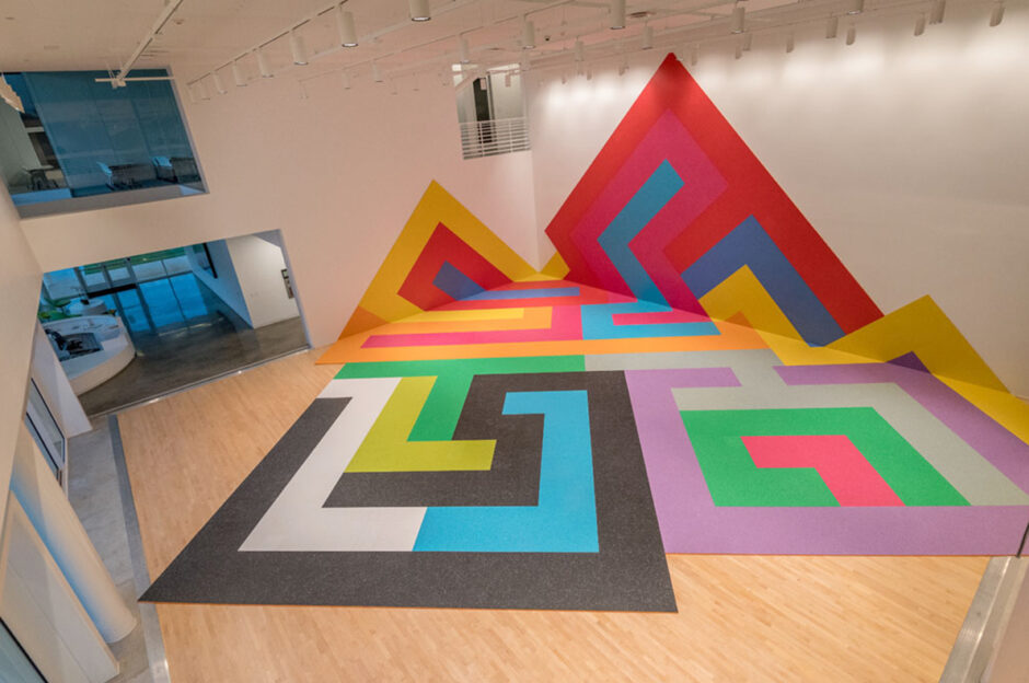
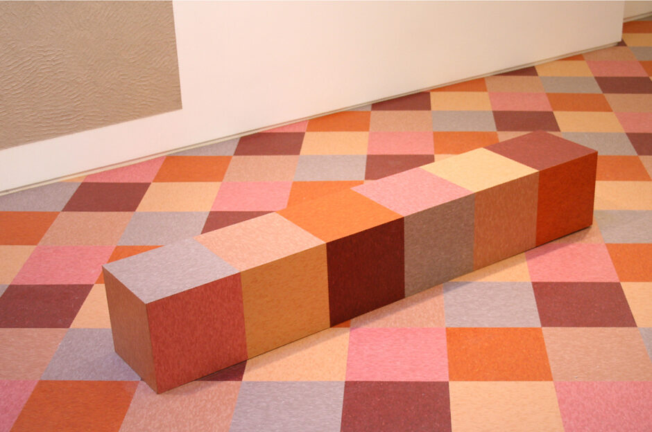
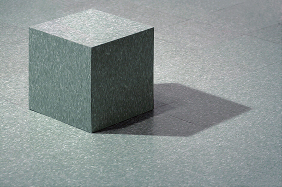
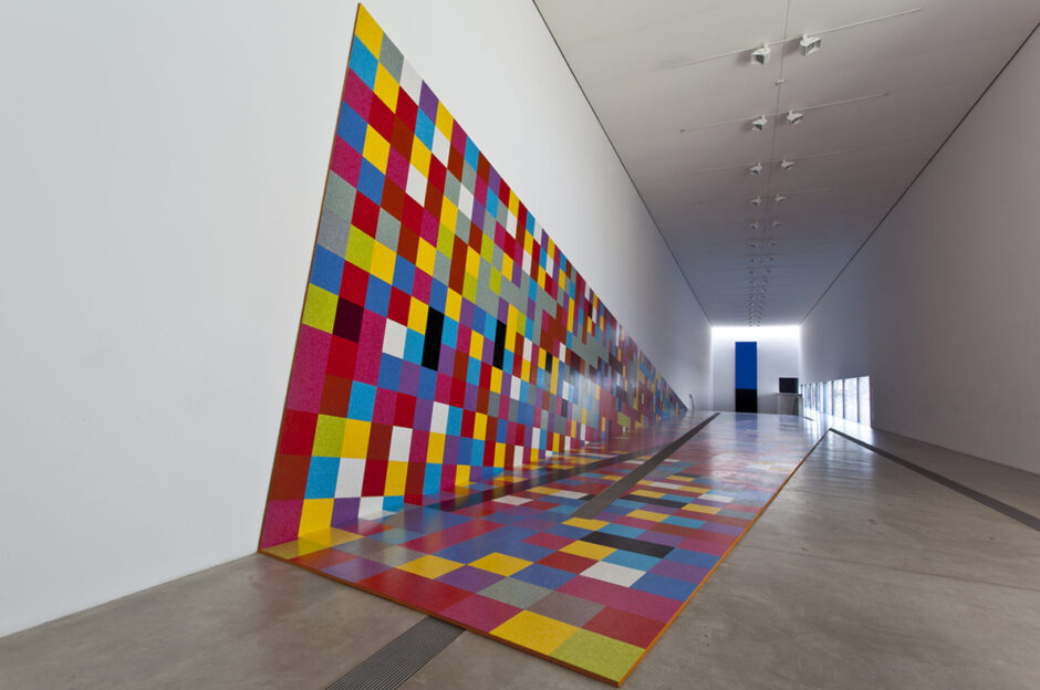
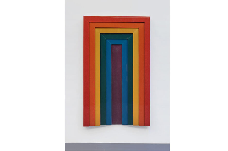
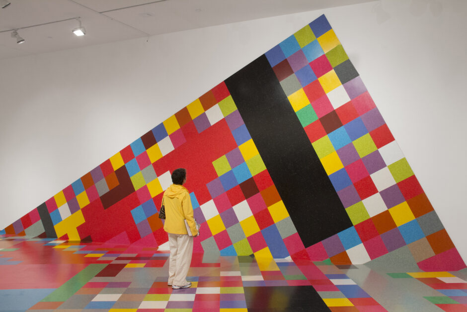 In 2007 Scanavino began working with VCT tile, a material commonly used to floor institutional settings like hospitals, schools, courthouses and government buildings. VCT appealed to the artist for its familiarity and societal connotations, but also for the fact that the material itself had color built in. There was no separation between the tone and the physical object – whether it be bright and cheerfully mixed-and-matched, or staid and monochromatic. These initially modest, discrete sculptural works took on a grand scale in 2014 when Scanavino was invited to create a monumental work for the Pulitzer Foundation of the Arts in St. Louis, MO. The large work, titled “Candy Crush” became a social sculpture and site for performances and visitor interaction. Subsequent projects include installations at the Aldrich Contemporary Art Museum in Ridgefield, CT, (above) and at the Moody Center for the Arts at Rice University in Houston, TX.
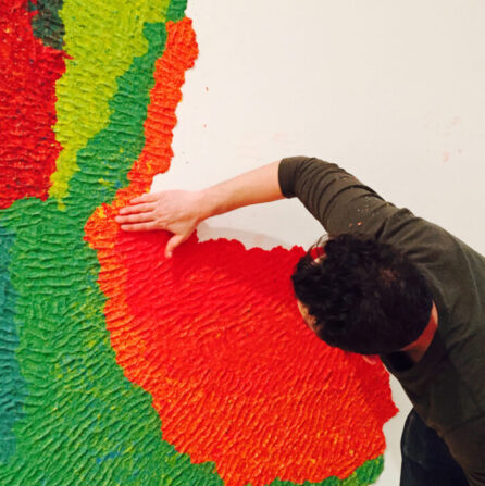
Paper Pulp
Paper pulp provided Scanavino with another vehicle for working with deeply saturated color. His practice of pulping paper began with newspapers (the New York Times, the Financial Times) in 2008. By reconstituting the day’s newspapers, he was able to incorporate the specific inks of the day’s print news into the overall tone of the work. Pressing the pulp directly on the wall created a record of time and place while showing the artist’s fingerprints and revealing the work’s making. Eventually Scanavino began using highly pigmented Italian art papers to convey boldly saturated colors in painterly wall works.
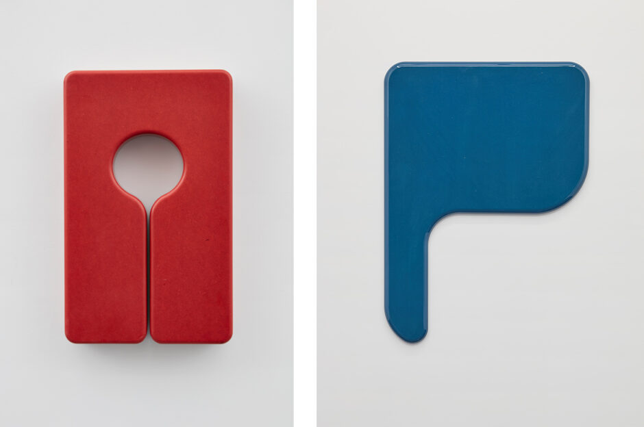
Valchromat
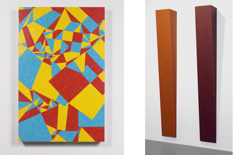
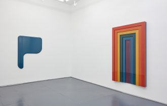 In 2016, Scanavino’s material research brought him to a new industrial material called Valchromat, marketed for commercial uses in furniture and cabinetry design. Valchromat is a condensed fiber material that could be laminated and carved into sculptural works. The appeal of this material lay in its even pigmentation throughout, again allowing Scanavino to create works in which the material and color are fused. Imagery, which had all but disappeared from his work, began to reemerge in the representation of life vests, school desks, and rainbows.
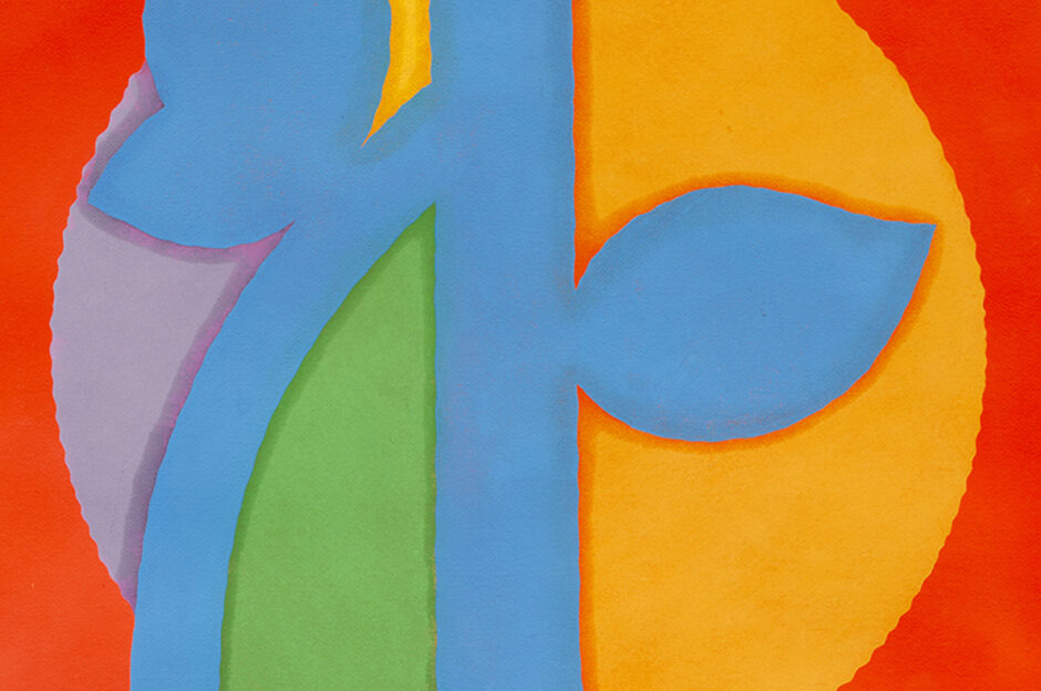
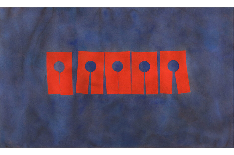
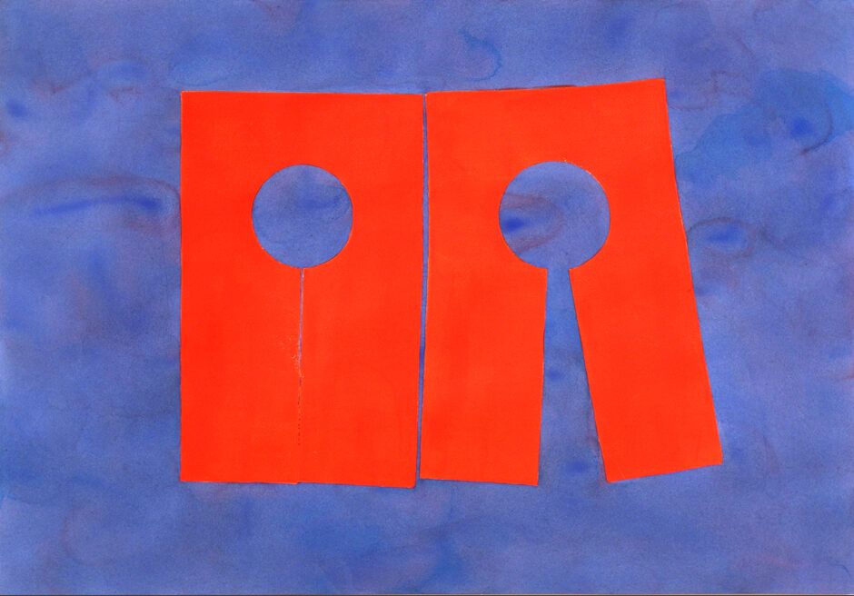 Ink on Watercolor
Images of life vests and tree branches also began to appear in a new series of works on paper in which Scanavino inked large rubber stamps with oil-based ink and pressed them upon paper that had been painted with watercolor. The color combinations were electrified by the interaction of the oil- and water-based media, creating a material reaction between saturated tones. The bright red life vests felt adrift and but also apart from their watery surroundings; the line between sky and branch became a point of vibration; and our eye was forced to reconcile the high contrast images at the line where materials meet.
Scanavino’s materials have become a fully realized vernacular in which art historical references and conceptual questioning, while both still fully present, are surpassed by aesthetic pleasure.

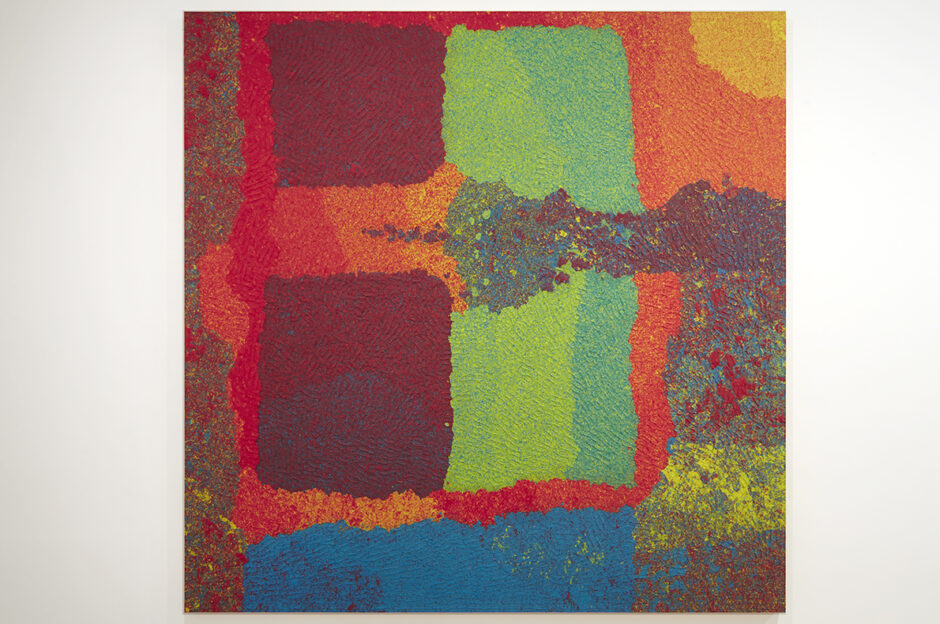
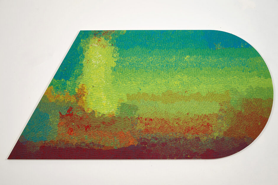
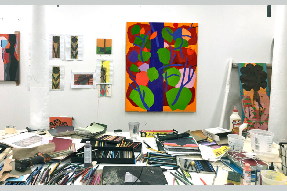
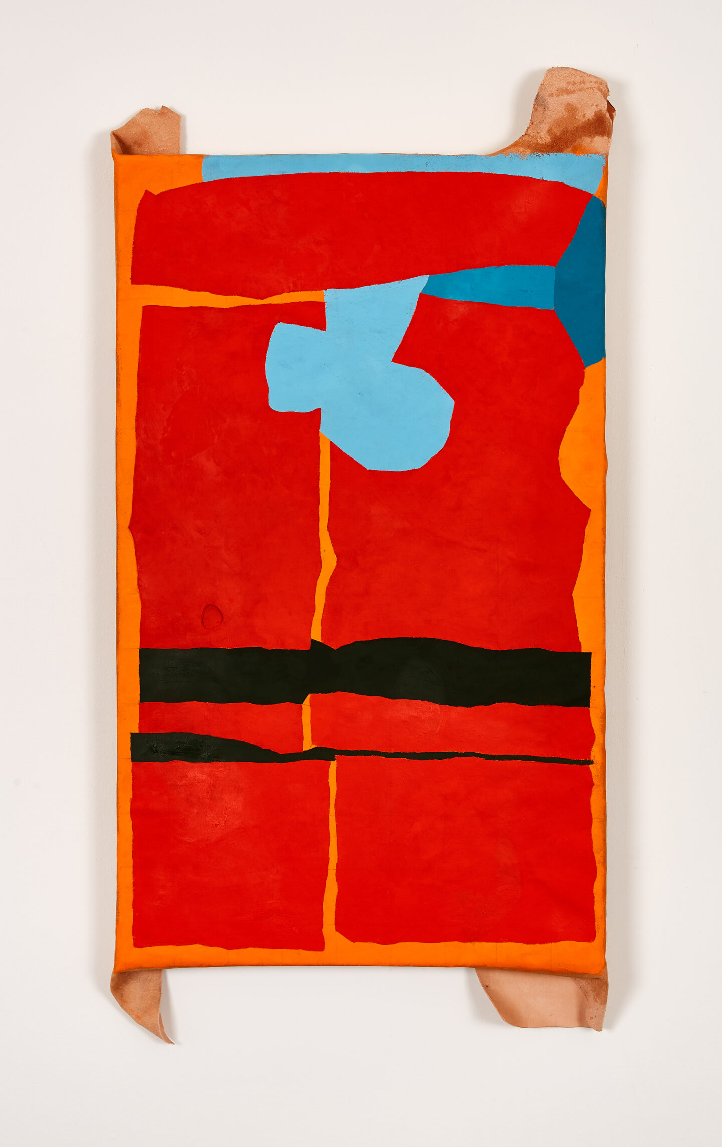
Recent works continue Scanavino’s pursuit of color, now created with oil paints brushed directly onto stretched calfskin leather. The brightly pigmented oils sit on the surface of the slightly textured leathers somewhat like encaustic paint, allowing Scanavino’s hand to enter into the works through brushstroke and mark. The wide spectrum of vibrant oil paint color has also contributed to new forms as hues bounce off of each other. The paintings feature vivid flames and kaleidoscopic trees and nests, as well freshly complicated takes on earlier subjects like life vests, branches, and sunsets.
David Scanavino
Lifevest, 2021
oil on unmilled calfskin and linen
30 ½ × 18 ¼ inches (77.47 × 46.36 cm)
The life vest is a subject Scanavino has worked with in different forms for the last eight years. Suggestive of safety as well as distress, the image here is abstracted into blocks of color and is seemingly set into motion through its fractured component parts. On the outer corners, the folds of the calfskin ground extend beyond the stretchers, extending the form into three dimensions.
Klaus von Nichtssagend Gallery is pleased to include new works by David Scanavino in Booth 5.14 at NADA Miami, December 1-4, 2021.
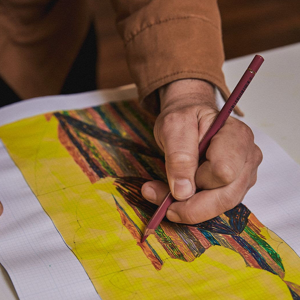
New Works on Paper
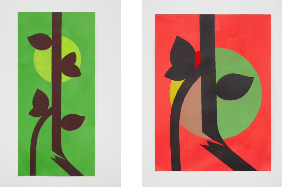
These works were started at the beginning of the pandemic when my family and I were staying home in a one bedroom apartment in Providence, RI. Like so many people during that time, daily walks were a way to get out and breath fresh air. My daughter and I took pleasure in seeing the spring flowers blooming. These drawings were a type of stress management: one color after another, same tight mark again and again. But I also think the flower was kind of hopeful. New life, something sprouting. Time moving forward. Looking back, I think they embody both of those feelings, hope and fear.
– David Scanavino
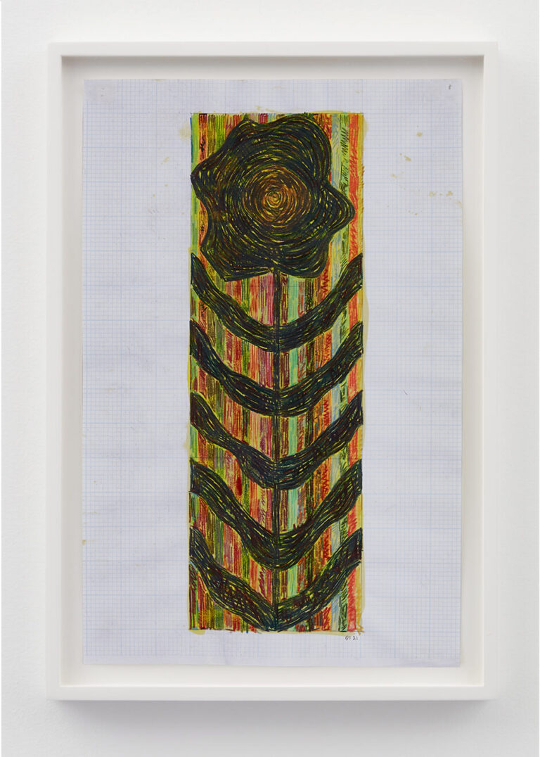
David Scanavino
Flower (Providence), 2021
color pencil on grid paper
17 × 11 inches (43.18 × 27.94 cm)
DS1165
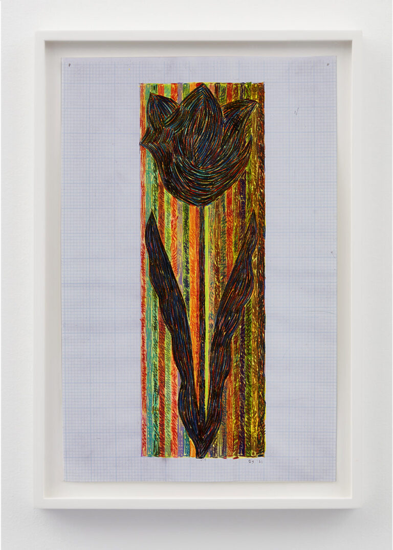
David Scanavino
Flower (Providence), 2021
color pencil on grid paper
17 × 11 inches (43.18 × 27.94 cm)
DS1167
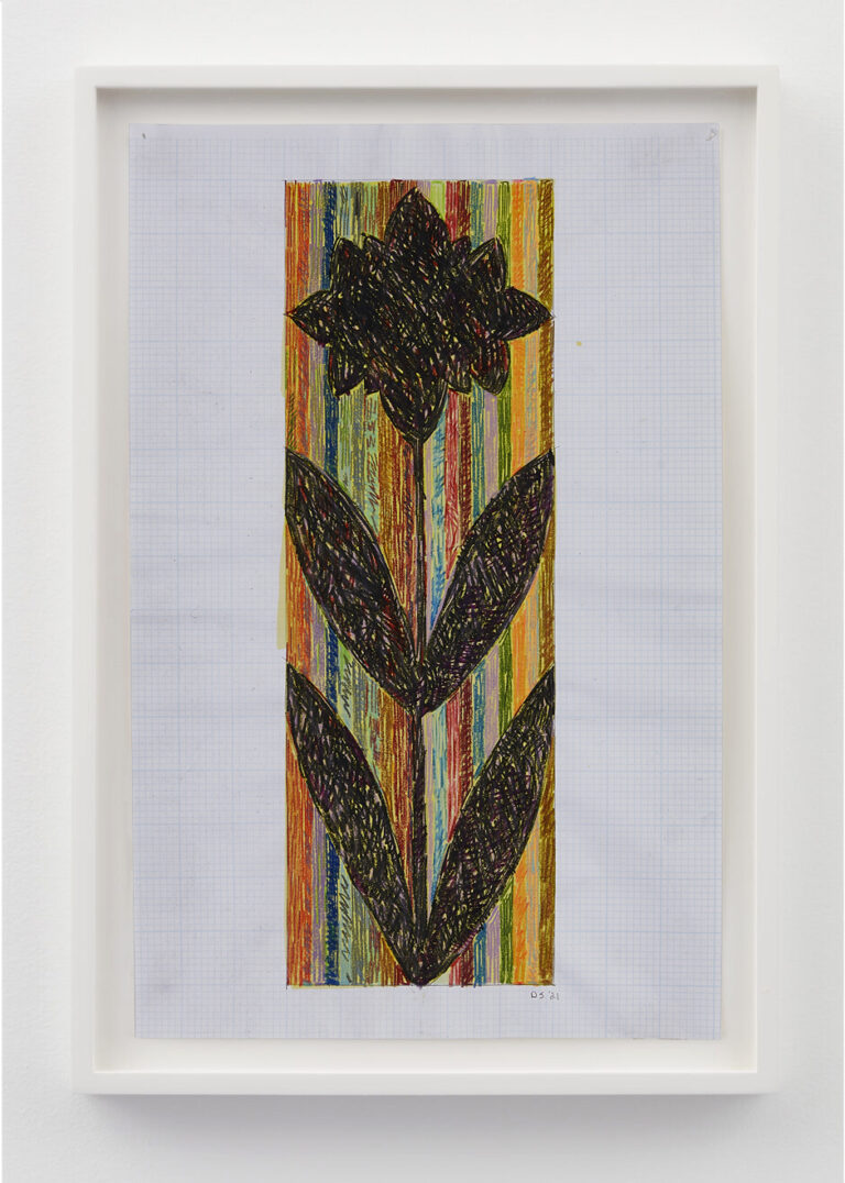
David Scanavino
Flower (Providence), 2021
color pencil on grid paper
17 × 11 inches (43.18 × 27.94 cm)
DS1166